24
Sep2013
Better P6 Float Management through Proactive Analysis
…if the Finish Date Variance is trending in a negative path, the activity may soon have negative float.
As many times as I have conducted Primavera P6 training, I am always surprised by the under use of one of the basic P6 tools.
A Scheduler painstakingly builds a schedule to reflect reality and then after the project starts, neglects to take advantage of the opportunity to be proactive in managing negative float and variance trends. The tool is the P6 Baseline. Sure, most Schedulers create a baseline at the onset of a project and, if following best practices, assign it to the Project Baseline to make it globally available for all users to view. Assigning to the Project Baseline ensures that any P6 User comparing the “BL Columns and Gantt Bars” is viewing data from the original Baseline.
But how about Updated Baselines for trend analysis?
With all the focus on managing negative float within a schedule, the Finish Date variance trends sometimes get lost in the shuffle. It is extremely important to understand that, even when an activity has positive float, if the Finish Date Variance is trending in a negative path, the activity may soon have negative float. The ability to see the negative trend and adjustment the schedule accordingly can prevent the activity from ever having negative float.
Consider the following:
Utilizing data in the table below, at what point would you recognize that the Foundation activity had a negative float issue? CYCLE 5??
| Update # | Update Date | Activity | Float | BL1 Finish Date Variance |
|---|---|---|---|---|
| Cycle 1 | 6/15/2013 | Foundation | 12 | 0 |
| Cycle 2 | 6/30/2013 | Foundation | 9 | -3 |
| Cycle 3 | 7/15/2013 | Foundation | 5 | -4 |
| Cycle 4 | 7/30/2013 | Foundation | 1 | -4 |
| Cycle 5 | 8/15/2013 | Foundation | -2 | -3 |
If you were capturing updated baselines each cycle and monitoring the negative Finish Date Variance trends, it is likely that you noticed a potential problem on Cycle 3. Being the proactive person you are, you take action to mitigate the negative trend activity from ever getting into negative float territory.
lySo what is the suggested best practice?
- Capture a baseline each time you update the schedule and assign it to the Primary Baseline
- Use variance analysis layouts to monitor trends using Activity Table columns such as BL1 Finish Date and BL1 Project Finish Date Variance.
- Consider capturing past period Finish Date Variances in User Defined Fields to watch for trends occurring over multiple Update cycles.
- Design P6 Report Writer reports to use color coded conditionally formatted cells to highlight negative float/negative finish date trends as red and positive float/negative finish date trends as yellow.
- Take action on the scenario where positive float activities have multiple Update Cycles with negative Finish Date Variances.
31
May2013
P6 User Group – Graneda Dynamic
One of the principles that we at Critical Business Analysis take great pride in is supporting Primavera P6 User Education through our continued partnership with Construction Process Solutions, Ltd. to promote and support the Southern Ohio P6 User Group.
Southern Ohio P6 User Group
Give Your Project A Graphics Boost
At the May 15th meeting, facilitated by Co-Chairpersons, Randy Rapin from Construction Process Solutions, Ltd. and Billie Feldkamp from CBA Inc., our very own Bob Ferris, Senior VP of Professional Services presented a webinar titled, “Graneda Dynamic: Making Oracle Primavera Graphics Even Better“.
Presented by: Robert C. Ferris – Senior VP of Professional Services at Critical Business Analysis, Inc.
May 15th Meeting
Graneda Dynamic:
Making Oracle Primavera Graphics Even Better
Graneda Dynamic has been the leading Project Management Graphics tool for more than 15 years. Now Graneda Dynamic supports the Oracle Primavera P6 product. With the ability to view Network Diagrams, Gantt Charts and Work Breakdown/Organizations Breakdown Diagrams, Graneda Dynamic is an essential tool for all organizations using Oracle Primavera.
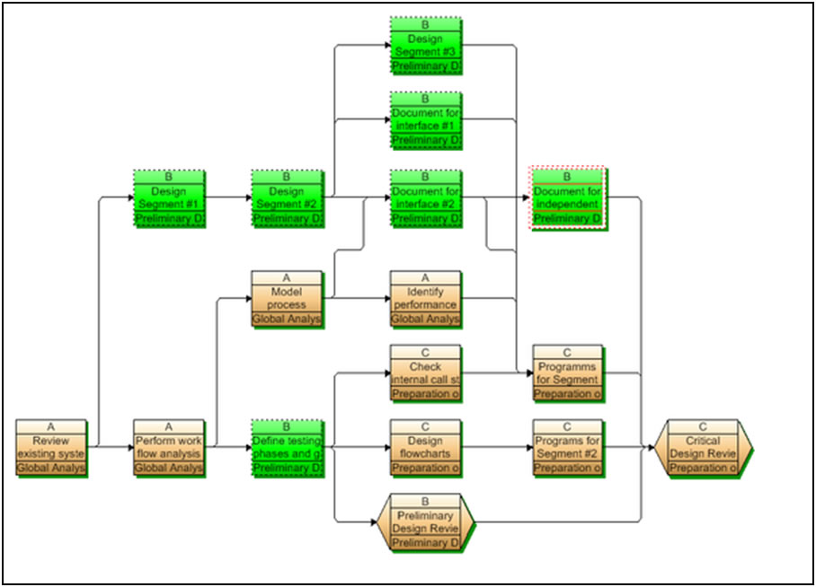
Network Diagram
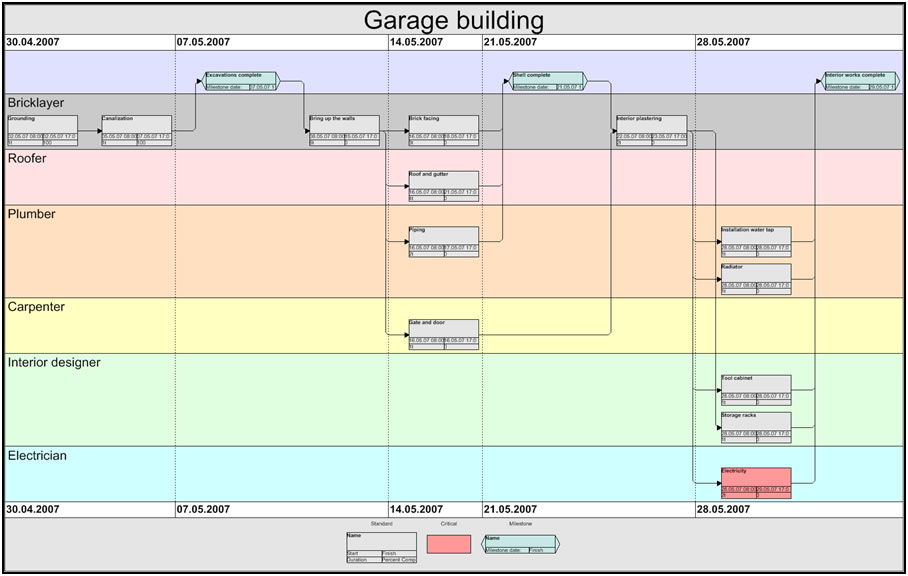
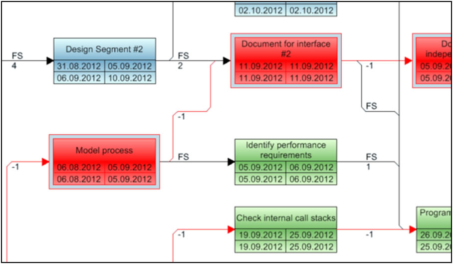
The Graneda Dynamic network diagrams are Best in Class because of their optimized node arrangement and minimum crossing of relationships. Grouping of activities by time orientation is also a key feature that is found in very few Project Management graphics products.
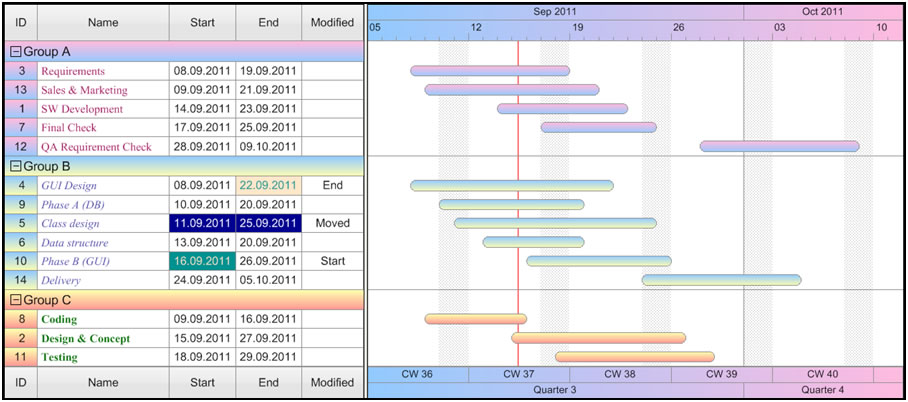
Gantt Chart
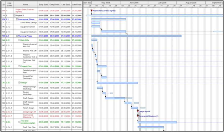
Although the Primavera P6 Gantt Chart is an excellent tool, the Graneda Gantt Chart is a step above. Some key features give you the ability to split the timescale into sections of varying detail. You have complete control of the bar shapes, colors and styles. In addition each activity can be displayed differently based on the data. When you want to display a lot of data, Graneda allows for stacked columns in the activity table area, giving you the maximum space for your bar chart.
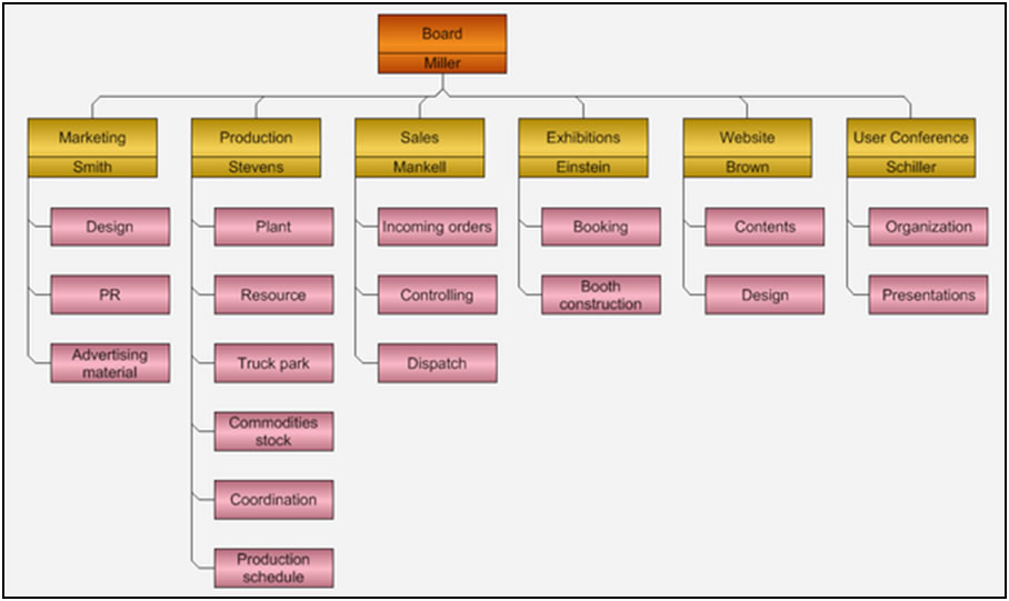
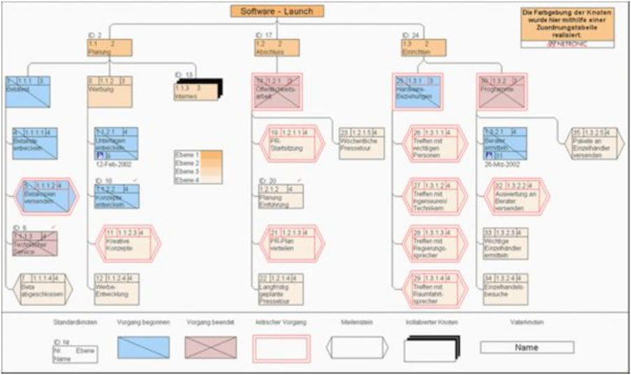
Work Breakdown Diagram
Activity lists are transformed into smartly organized graphical overviews. You can easily see the structure of your project at a glance. In the work breakdown diagram, sub-activities are structured and displayed hierarchically.
read more


